vlambda博客
学习文章列表

读书笔记《hands-on-full-stack-development-with-spring-boot-2-0-and-react》使用Reaction材质设置前端的样式-UI

Chapter 11. Styling the Frontend with React Material-UI

本章介绍如何在我们的前端使用 Material-UI 组件。我们将使用 Button 组件来显示样式按钮。模态表单输入字段被 TextField 组件所取代,这些组件具有许多不错的功能。 Material-UI 提供了 Snackbar 组件,它可以向最终用户显示 toast 消息。我们将 react-toastify 组件替换为 Snackbar 以获得统一的外观。最后,我们使用 AppBar 组件而不是 React 应用程序标头。

在本章中,我们将看到以下内容:

  • What is Material-UI?
  • How to use Material-UI components in our frontend
  • How to remove unused components in the React app

Technical requirements


我们在第 4 章中创建的 Spring Boot 应用程序,保护和测试您的后端< /em>,需要与上一章的修改(不安全的后端)一起使用。

我们还需要我们在上一章中使用的 React 应用程序 (carfront)。

Using the Button component

通过在终端 you 来安装 Material-UI " class="indexterm"> 正在使用并在安装完成后启动您的应用程序:

npm install @material-ui/core --save

让我们首先将所有按钮更改为使用 Material-UI Button 组件。将 Button 导入 AddCar.js 文件:

// AddCar.js
import Button from '@material-ui/core/Button';

更改按钮以使用 Button 组件。在列表页面中,我们使用主按钮,在模态表单中,使用大纲按钮:

  render() {
    return (
      <div>
        <SkyLight hideOnOverlayClicked ref="addDialog">
          <h3>New car</h3>
          <form>
            <input type="text" placeholder="Brand" name="brand" onChange={this.handleChange}/><br/> 
            <input type="text" placeholder="Model" name="model" onChange={this.handleChange}/><br/>
            <input type="text" placeholder="Color" name="color" onChange={this.handleChange}/><br/>
            <input type="text" placeholder="Year" name="year" onChange={this.handleChange}/><br/>
            <input type="text" placeholder="Price" name="price" onChange={this.handleChange}/><br/><br/>
            <Button variant="outlined" color="primary" onClick={this.handleSubmit}>Save</Button> 
            <Button variant="outlined" color="secondary" onClick={this.cancelSubmit}>Cancel</Button> 
          </form> 
        </SkyLight>
        <div>
            <Button variant="raised" color="primary" 
            style={{'margin': '10px'}} 
            onClick={() => this.refs.addDialog.show()}>
            New Car</Button>
        </div>
      </div> 
    );

现在,列表页面按钮应如下所示:

读书笔记《hands-on-full-stack-development-with-spring-boot-2-0-and-react》使用Reaction材质设置前端的样式-UI

模态表单按钮应如下所示:

读书笔记《hands-on-full-stack-development-with-spring-boot-2-0-and-react》使用Reaction材质设置前端的样式-UI

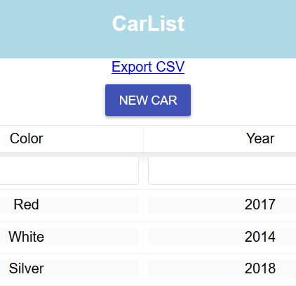
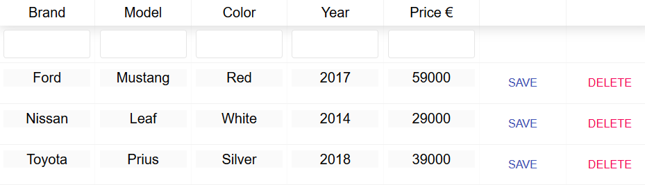
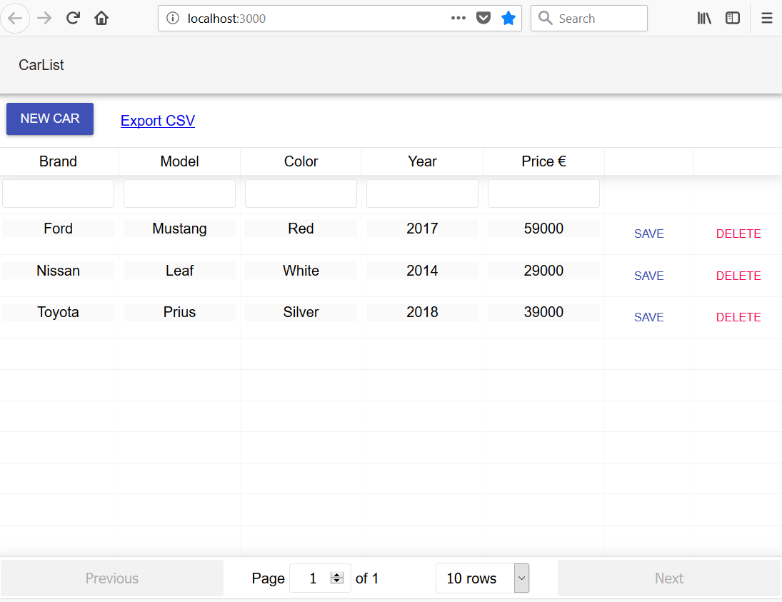
我们使用 car 表中的扁平变体按钮并定义 button 大小一样小。有关表格列,请参见以下源代码:

// Carlist.js render() method
const columns = [{
  Header: 'Brand',
  accessor: 'brand',
  Cell: this.renderEditable
}, {
  Header: 'Model',
  accessor: 'model',
  Cell: this.renderEditable
}, {
  Header: 'Color',
  accessor: 'color',
  Cell: this.renderEditable
}, {
  Header: 'Year',
  accessor: 'year',
  Cell: this.renderEditable
}, {
  Header: 'Price €',
  accessor: 'price',
  Cell: this.renderEditable
}, {
  id: 'savebutton',
  sortable: false,
  filterable: false,
  width: 100,
  accessor: '_links.self.href',
  Cell: ({value, row}) => (<Button size="small" variant="flat" color="primary" 
    onClick={()=>{this.updateCar(row, value)}}>Save</Button>)
}, {
  id: 'delbutton',
  sortable: false,
  filterable: false,
  width: 100,
  accessor: '_links.self.href',
  Cell: ({value}) => (<Button size="small" variant="flat" color="secondary" 
    onClick={()=>{this.confirmDelete(value)}}>Delete</Button>)
}]

现在,该表应如下所示:

读书笔记《hands-on-full-stack-development-with-spring-boot-2-0-and-react》使用Reaction材质设置前端的样式-UI

Using the Grid component

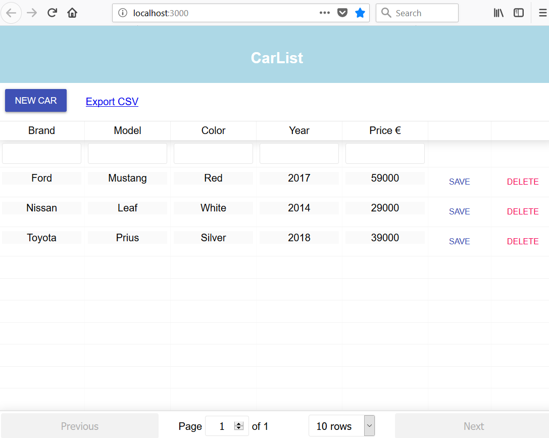
Material-UI 提供了一个 Grid 组件 可以用来获取一个grid 布局到你的 React 应用。我们将使用 Grid 来获得 New Item 按钮和 Export CSV 链接在同一行。

将以下导入添加到 Carlist.js 文件以导入 Grid 组件:

import Grid from '@material-ui/core/Grid';

接下来,我们将 AddCarCSVLink 包装在 Grid 组件中。 Grid 组件有两种类型——容器和项。这两个组件都包装在项目的 Grid 组件中。然后这两个项目的Grid 组件被包装在容器的 Grid 组件中:

// Carlist.js render() method
return (
  <div className="App">
    <Grid container>
      <Grid item>
        <AddCar addCar={this.addCar} fetchCars={this.fetchCars}/>
      </Grid>
      <Grid item style={{padding: 20}}>
         <CSVLink data={this.state.cars} separator=";">Export CSV</CSVLink>
      </Grid>
    </Grid>

    <ReactTable data={this.state.cars} columns={columns} filterable={true} pageSize={10}/>
    <ToastContainer autoClose={1500}/> 
  </div>
);

现在,您的应用程序应如下所示,并且按钮现在放置在一行中:

读书笔记《hands-on-full-stack-development-with-spring-boot-2-0-and-react》使用Reaction材质设置前端的样式-UI

Using the TextField components

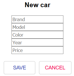
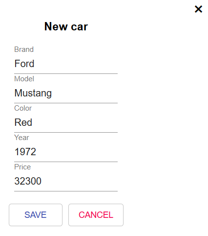
在本节中,我们将更改模态 forminput "id325568673" class="indexterm"> 使用 Material-UI TextField 组件。将以下导入语句添加到 AddCar.js 文件中:

import TextField from '@material-ui/core/TextField';

然后,将输入更改为表单中的 TextField 组件。我们使用 label 属性来设置 TextField 组件的标签:

render() {
  return (
    <div>
      <SkyLight hideOnOverlayClicked ref="addDialog">
        <h3>New car</h3>
        <form>
          <TextField label="Brand" placeholder="Brand" name="brand" onChange={this.handleChange}/><br/> 
          <TextField label="Model" placeholder="Model" name="model" onChange={this.handleChange}/><br/>
          <TextField label="Color" placeholder="Color" name="color" onChange={this.handleChange}/><br/>
          <TextField label="Year" placeholder="Year" name="year" onChange={this.handleChange}/><br/>
          <TextField label="Price" placeholder="Price" name="price" onChange={this.handleChange}/><br/><br/>
          <Button variant="outlined" color="primary" onClick={this.handleSubmit}>Save</Button> 
          <Button variant="outlined" color="secondary" onClick={this.cancelSubmit}>Cancel</Button> 
        </form> 
      </SkyLight>
      <div>
         <Button variant="raised" color="primary" 
            style={{'margin': '10px'}} 
            onClick={() => this.refs.addDialog.show()}>New Car</Button>
      </div>
    </div> 
  );

修改后,模态表单应如下所示:

读书笔记《hands-on-full-stack-development-with-spring-boot-2-0-and-react》使用Reaction材质设置前端的样式-UI

Using the AppBar component

在本节中,我们将用 AppBarapp 标头> 组件。导入 AppBarToolbar 组件:

import AppBar from '@material-ui/core/AppBar';
import Toolbar from '@material-ui/core/Toolbar';

div 标头 element >App.js 文件。将 AppBar 组件添加到 render() 方法并放置 Toolbar里面的组件。 Toolbar 组件包含应用栏中显示的文本:

// App.js
import React, { Component } from 'react';
import './App.css';
import Carlist from './components/Carlist';
import AppBar from '@material-ui/core/AppBar';
import Toolbar from '@material-ui/core/Toolbar';

class App extends Component {
  render() {
    return (
      <div className="App">
        <AppBar position="static" color="default">
          <Toolbar>CarList</ Toolbar>
        </ AppBar>
        <Carlist /> 
      </div>
    );
  }
}

export default App;

现在,您的前端应该如下所示:

读书笔记《hands-on-full-stack-development-with-spring-boot-2-0-and-react》使用Reaction材质设置前端的样式-UI

Using the SnackBar component

我们已经使用 react-toastify 组件实现了 toast 消息。 Material-UI 提供了一个名为 SnackBar 的组件,可用于向最终用户显示消息。为了在我们的应用程序中获得统一的外观,让我们将该组件用于消息。

我们现在可以从 Carlist.js 文件中删除 react-toastify 导入,我们还可以通过键入以下内容删除组件命令到您正在使用的 终端

npm remove react-toastify

要开始使用 Snackbar 组件,请将以下导入添加到 Carlist.js 文件中:

import Snackbar from '@material-ui/core/Snackbar';

Snackbar 需要两个新的状态值,一个用于消息,一个用于状态。将这两个状态值添加到构造函数中。状态状态称为 open,它定义 Snackbar 是否可见:

constructor(props) {
  super(props);
  this.state = { cars: [], open: false, message: ''};
}

然后,我们将 Snackbar 组件添加到 render() 方法中。 autoHideDuration 属性定义了在调用 onClose 之前等待的时间(以毫秒为单位)。要显示 Snackbar,我们只需将 open 状态值设置为 true 并设置消息:

// Carlist.js render() method's return statement
return (
  <div className="App">
    <Grid container>
      <Grid item>
        <AddCar addCar={this.addCar} fetchCars={this.fetchCars}/>
      </Grid>
      <Grid item style={{padding: 20}}>
        <CSVLink data={this.state.cars} separator=";">Export CSV</CSVLink>
      </Grid>
    </Grid>

    <ReactTable data={this.state.cars} columns={columns} filterable={true} pageSize={10}/>
    <Snackbar style = {{width: 300, color: 'green'}} open={this.state.open} onClose={this.handleClose} autoHideDuration={1500} message={this.state.message} />
  </div>
);

接下来,我们要实现 handleClose 函数,该函数在 onClose 事件中被调用。该函数只是将 open 状态值设置为 false

handleClose = (event, reason) => {
  this.setState({ open: false });
};

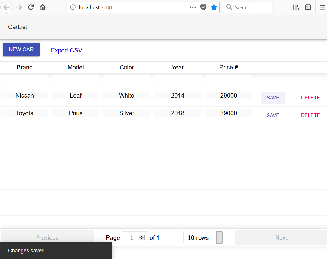
然后,我们用 setState() 方法替换 toast 消息, set open 值到 true 和显示的文本到 message 状态:

// Delete car
onDelClick = (link) => {
  fetch(link, {method: 'DELETE'})
  .then(res => {
    this.setState({open: true, message: 'Car deleted'});
    this.fetchCars();
  })
  .catch(err => {
    this.setState({open: true, message: 'Error when deleting'});
    console.error(err)
  }) 
}

// Update car
updateCar(car, link) {
  fetch(link, 
  { method: 'PUT', 
    headers: {
      'Content-Type': 'application/json',
    },
    body: JSON.stringify(car)
  })
  .then( res =>
    this.setState({open: true, message: 'Changes saved'})
  )
  .catch( err => 
    this.setState({open: true, message: 'Error when saving'})
  )
}

以下是使用 Snackbar 组件的消息截图:

读书笔记《hands-on-full-stack-development-with-spring-boot-2-0-and-react》使用Reaction材质设置前端的样式-UI

Summary


在本章中,我们使用 Material-UI 完成了我们的前端。 Material-UI 是实现 Google 的 Material Design 的 React 组件库。我们用 Material-UI Button 组件替换了所有按钮。通过使用 Material-UI TextField 组件,我们的模态表单焕然一新。我们删除了 React 应用程序标头并改用 AppBar 组件。现在使用 Snackbar 组件向最终用户显示消息。经过这些修改后,我们的前端看起来更加专业和统一。在下一章中,我们将重点介绍前端测试。

Questions


  1. What is Material-UI?
  2. How should you use different Material-UI components?
  3. How should you remove unused components?